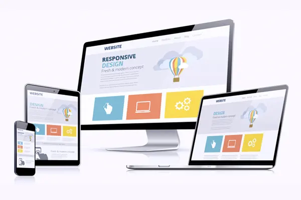
People access websites from screens of many sizes, orientations and input methods. Responsive web design allows the same experience to adapt without requiring separate content for every device.
Design around content and tasks
A responsive layout should preserve what users need to understand and do. Elements may move or change presentation, but essential information and functionality should remain available.
Use flexible foundations
Fluid grids, adaptable media and content-driven breakpoints help layouts respond to available space. Navigation and controls should remain readable, touch-friendly and accessible at every size.
Plan performance from the beginning
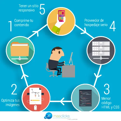
Responsive does not automatically mean fast. Serve appropriately sized images, avoid loading unnecessary assets and test on actual devices and slower networks.
Maintain one coherent experience
A single responsive implementation can simplify content governance, analytics and search optimization. It also reduces the risk of mobile and desktop versions presenting conflicting information.
The objective is not to make every viewport look identical. It is to give every user a clear, complete and reliable way to interact with the website.